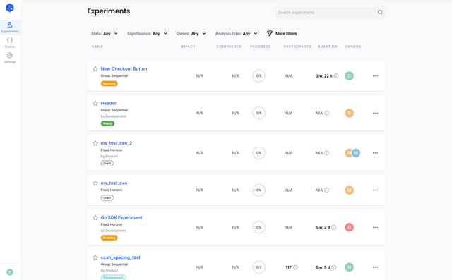
The Dashboard
Welcome to your Web Console dashboard! This is where you will create, view and monitor your experiments. If there aren't any experiments in your list, learn how to create one in the creating an experiment docs.
Experiment Details
To enter the experiment details page, click on the name of one of your experiments.
Dashboard Tab
The dashboard tab is where you will find fundamental information about your experiment, including general information, recommended actions, experiment progress and details about your metrics.
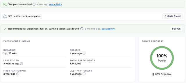
Information at a glance
At the top of the dashboard tab, you can see some of the most important information about your experiment.
Alerts
In order to help you optimize the data that your experiments are bringing in, and to clean up your code, we have provided various warning flags to give you insights into your experiments.
Sample Size Reached
The "Sample Size Reached" alert tells you that your experiment has been exposed to enough participants for you to make a decision about it.
Code Cleanup Needed
The "Code Cleanup Needed" alert reminds you to clean up your code after a decision has been made on an experiment. If a decision was made too long ago and the SDK is still receiving exposure calls from this experiment, this flag will come up.
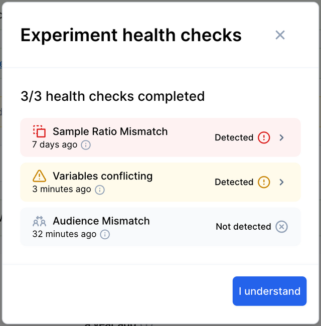
Audience Mismatch Detected
The "Audience Mismatch" alert tells you that your experiment has been exposed to some participants who should not have experienced it. This can happen when a targeting audience has been set with Strict Mode off. This serves as a reminder to put the required checks in your code to separate that targeting audience.
Sample Ratio Mismatch
The "Sample Ratio Mismatch" alert tells you that the split ratio between your variants is not accurate. For example, if you had an experiment with 2 variants and a 50/50 split, but Variant A had 1,000 impressions and Variant B had 2,000 impressions, a sample ratio mismatch would be flagged.
This usually means that the experiment has been implemented incorrectly and typically has a severely negative effect on the statistical validity of your presented results.
Traffic Allocation Warnings
The "Traffic Allocation" alert either informs you that your traffic allocation is below 100% or warns you that it is set to 0%. Having a traffic allocation of 0% means that no participants will be exposed to your experiment.
Variable Conflicts
A variable conflict is when you have a variable key that is being used in more than one experiment. This can cause issues when pulling variable values from ABsmartly in your code.
Health Checks
The health checks section allows you to see the status of the various checks that ABsmartly runs on your experiments to generate the alerts mentioned above.
If you click on the health checks alert, you will be taken to the health checks panel, where you can see the details of the health checks that have been run.
Recommended Actions
When an experiment has reached a point where a decision can be made, a recommended action will pop up, telling you what the best action to take is.
The recommended actions are as follows:
| Positive | Negative | Insignificant |
|---|---|---|
| A winning variant was found and the experiment can be put full-on. | No variant is superior to the control variant and the experiment should be stopped. | The control variant is equal to the new variants and the experiment should be stopped. |
Experiment Data Summary
This is where you will find key information about your experiment including its duration, when it was created, when it was last edited, how many participants have taken part in the experiment and when the first and last participant were recorded.
Power Progress Circle (Fixed Horizon Only)
The power progress circle is used to inform you of how much longer the experiment will take. The current power percentage is displayed in the middle of the circle and your objective power (your goal) is displayed underneath. Once the current power has reached the objective power, the experiment will have gathered enough information for you to make a decision on it. Hovering over the power progress circle will provide you with more specific details about the current power.
Group Sequential Experiments
Group sequential experiments are a powerful tool for analyzing data in clinical trials and experiments, allowing researchers to make informed decisions based on interim results. These experiments divide the trial into several stages, with each stage offering the opportunity to assess the data and decide whether to continue or stop the trial. Two types of boundaries are utilized in this process: efficacy and futility boundaries.
Efficacy boundaries determine whether the experimental treatment is statistically significantly better than the control, based on the predefined confidence or significance threshold. If the efficacy boundary is crossed at any stage, the experiment is stopped automatically, as the experimental treatment has demonstrated a notable improvement over the control. Consequently, no further data would be gathered, and the study's resources could be conserved.
Futility boundaries, on the other hand, help identify when there is little to no chance of the experimental treatment outperforming the control by the end of the trial. Crossing the futility boundary indicates that it is unlikely that continuing the trial would yield a significant result, suggesting that it is best to stop the study early and redirect resources.
Group sequential experiments offer several benefits, including increased efficiency in resource allocation, reduced exposure to ineffective treatments, and the potential to reach conclusions faster. By monitoring both efficacy and futility boundaries, researchers can make evidence-based decisions about whether to continue or halt a trial, ultimately leading to more accurate and ethical results in various fields, from medicine to marketing.
Group Sequential Progress (Group Sequential Only)
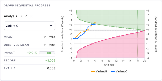
When viewing a group sequential experiment, this section will be your place to check on how it is doing. You can select a variant at the top of the card, and you will be able to see various values related to this analysis point.
Mean
The mean is the estimated bias-adjusted mean. When a group sequential experiment is stopped earlier or later than a fixed horizon experiment would be, the impact will be biased. We use the information at the stopping point to reduce this bias and output a more truthful mean.
Observed Mean
This is the mean of the primary metric that is observed in the data.
Impact
The impact that your experiment has had on your primary metric. See the Impact on Main Metrics section for more information.
ZScore
The Z-score is a standardized measure of how far away from the null-hypothesis the observed data is, considering observed impact, variance and number of participants.
PValue
The pvalue is a representation of how close to certainty you can be about the results. The lower the pvalue, the more confident you can be about the data shown.
Metrics Performance
The metrics performance graph shows how your experiment has performed in relation to your specified metrics. See the goals section of the Dashboard Settings docs to learn more about metrics.
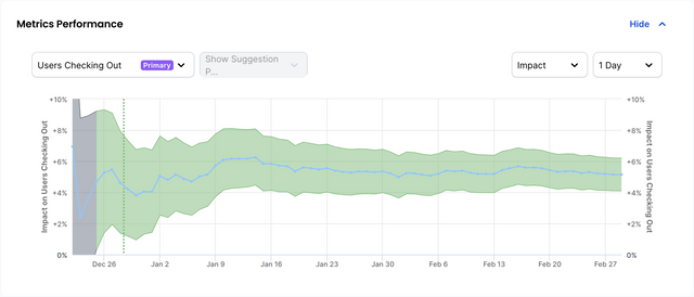
Color Code
The color-coding of the graph is as follows:
- The graph is green when the API is confident that this metric has been positively effected.
- The graph is pink when the API is confident that this metric has been negatively effected.
- The graph is purple when the API is confident that this metric has been effected, but it is unsure whether it is good or bad (an unknown metric).
- The graph is gray when the API is unsure whether this metric has been negatively or positively effected (inconclusive).
Description Tab
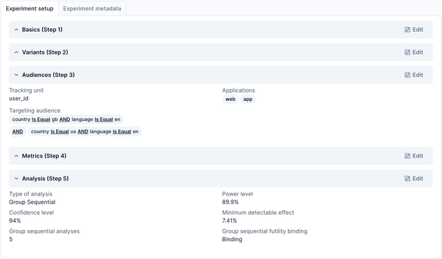
The description tab is where the details of your experiment are kept, including your experiment setup, as well as any added metadata. This is useful so that anyone in your team can find out why an experiment is running, how it is set up and what the owner of that experiment is trying to achieve.
Experiment Setup
The experiment setup section gives information about each step of the experiment's creation. For more information on these steps, checkout the experiment creation tutorial.
Experiment Metadata
The experiment metadata section provides information about the owners of an experiment, the team (if any) associated with it, any tags that have been attached to it and any description fields that have been added to it.
The description fields are completely customisable in the Platform Settings, but the defaults are:
- Hypothesis
- Prediction
- Purpose
- Implementation Details
- Action Points
- Other
Participants Tab
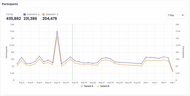
The participants view shows your participants' data in real-time. This includes the number of participants per experiment and when they experienced their variant of the experiment.
Sample Size Reached
When your experiment has reached a sample size that is large enough to make a decision on the experiment. That moment will be shown on the graph as a dotted green line as depicted above.
Graph Annotations
In the participants graph you can add annotations to the data. This can give insights to your team about why the participants graph looks the way it does. For example, you could add an annotation to a day when a lot of participants experienced the experiment, letting everybody know that a new ad campaign was released that day. When creating an annotation, you can decide whether you want this annotation to be shown on all experiments, or just the one that you are currently viewing.
Explore Tab
In the explore tab, you can filter and see information about how your metrics have performed during an experiment (Read more about metrics in the creating a metric docs). Metrics can be filtered by segment, by time period and can display the data based on the first exposure or the last exposure of the participant. Once you have selected a metric, you can see the data in the summary, graphs and segments tabs.
Summary
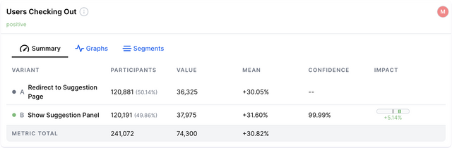
The summary view gives you a list of your variants and the data that has been collected by each. The columns can be described as follows:
| Name | Definition |
|---|---|
| Variant | The name of your variants. This could be a custom name, or simply Variant A, Variant B etc. |
| Value | The value of this particular metric per variant. This can be formatted in the goal's settings using the format string. |
| Mean | The value of this metric divided by the number of participants. For example, the number of bookings made divided by the number of users who experienced the variant. |
| Confidence | The inverse of this metric and variant's p-value. Confidence = (1 - pvalue), formatted as a percentage. |
| Impact | The confidence interval of the impact on this metric. This is calculated using Fieller’s Theorem. |
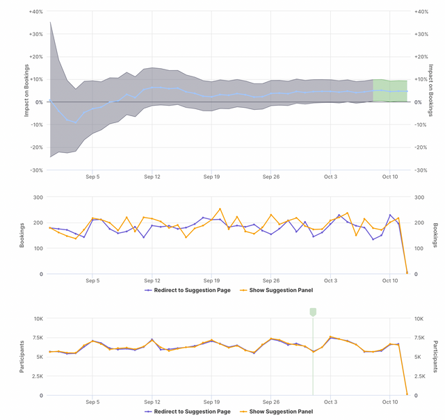
Graphs
In the graphs tab, you will see your metric displayed as 3 graphs:
- Confidence interval for the impact of the selected variant over time
- Value over time for the control treatment and the selected variant
- Participants over time for control and the selected variant
If you have more than 2 variants, a dropdown will appear at the top and allow you to choose which one to see the data of.
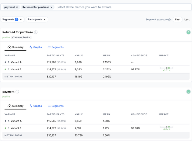
Segments
The segments tab shows the confidence and impact on this metric per variant, but it splits the data to give you a more specific insight into what kind of users are having a positive or negative experience.
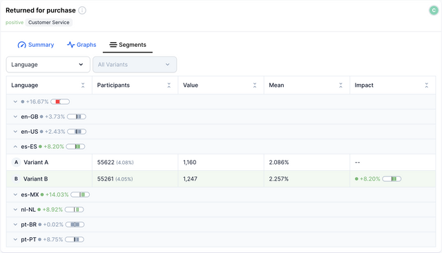
In the example above, our "Returned for purchase" metric has been positively impacted by our variant, but when we look at the segments table, we find that users who speak Spanish or Dutch are much more impacted than users who speak other languages.
See Segments in the Dashboard Settings docs for information on creating segments, or check out the Attributes section of the SDK docs for information on how to pass them to the SDK in your code.
Iterations Tab
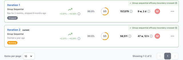
The iterations tab is where you can see the history of your experiment and browse through previous iterations of it. A new iteration is created when an experiment is restarted.
When restarting an experiment, you are given the option to either re-shuffle existing participants or to start the experiment from scratch. If you choose to re-shuffle existing participants, users who saw a particular variant in the previous iteration will be exposed to the same variant in the new iteration.
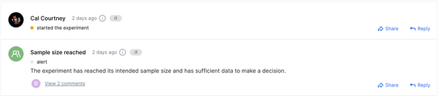
Activity Tab
The Activity Tab is where your team can come together. ABsmartly is more than just an experimentation platform - It's a knowledge base. Giving each member of your team more insight into why an experiment exists, what it's testing for and what the outcome is so far.
The activity tab has support for:
- Rich-text commenting
- Replies
- Reports
- Images
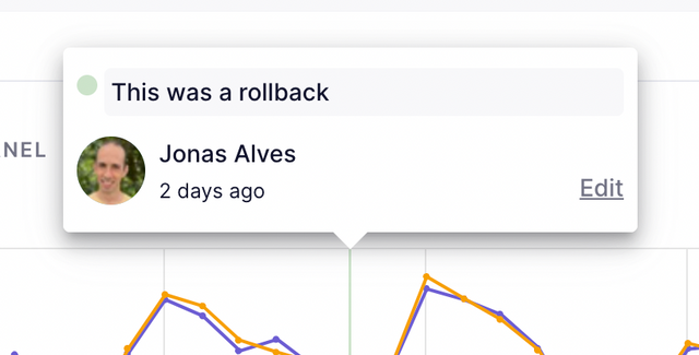
Alert Activity
When an alert is triggered, it will also be shown in the activity tab allowing for easy tracking and commenting.